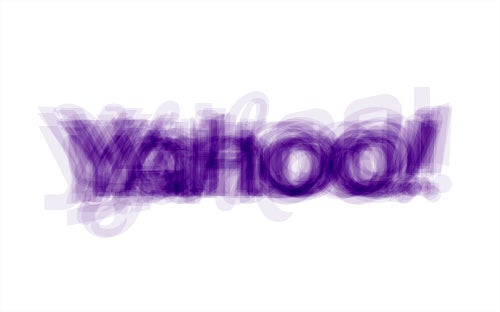
What all of Yahoo’s fake logos look like smushed together

By Adam Pasick and David Yanofsky
Published
Yahoo unveiled a new stripped-down version of its logo on Wednesday night after a month of variations. Chief marketing officer Kathy Savitt explained that the company’s “30 days of change” exercise was “our way of having some fun while honoring the legacy of our present logo.” At Quartz we decided to have some fun ourselves, by merging all 29 Yahoo samples into a single image—a Frankenstein’s monster of Yahoo logos:
Here’s the official new logo (and accompanying video):
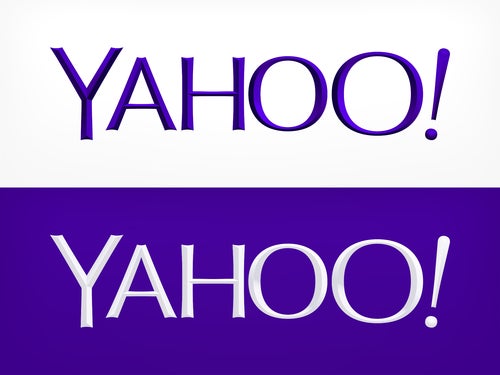
Early reviews of the logo itself are mixed, but as a marketing exercise it looks like a home run.